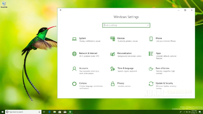
Every software app needs some updates to its user interface. Thus with the Windows 10 Settings app. Along with Windows 10 Insiders Preview Build 17063, Microsoft changed the look & feel of the Settings app with Acrylic material effect.
If you are a Windows Insider, and in the Fast Ring, do not forget to checkout this build. It has bunch of changes and fixes for you to explore.

The fluent design is now part of the Windows 10 Settings app. Microsoft redesigned the app to have an Acrylic material effect on that to have a consistent look & feel across the system. The new settings homepage includes a design that now has smaller icons with their titles aligned to the right. It also changed the shape of each tile to have a rectangular look instead of square. Also, the existing gear icon has been replaced with a new home icon with the shape of a house.
Not a Windows Insider? Or, didn't get the time to install/explore the build? Not to worry! Here's a small video demonstration for you:


