Few days ago we discussed about RadDataBoundListBox from Telerik RadControls library which maximum WPDev want to integrate in their Windows Phone app. Today in this blog post we will discuss about another control from that library.
RadSlideView control is also another important control from that library which we will discuss today and maximum developers can find it useful. So, continue reading.
Before starting let me tell you first that, this control library is not free. You can purchase it for $99 from Telerik. But there are opportunities for you to win it free. Check out the below posts and see if you are still eligible for those giveaways:
Using Telerik’s SlideView control, you can provide the user option to slide the items from left-to-right or right-to-left by fingers. Also, you can provide buttons to move previous or next item. Let’s start beginning with the code snippet with our sample demo application.
To begin with, you need to add the XMLNS namespace in your XAML page once you added the binary assembly reference in your project. It is part of the Telerik.Windows.Controls.Primitives assembly but available in the Telerik.Windows.Controls namespace.
Here is the xmlns namespace declaration that you need to add at the top of your xaml page:
Now include the RadSlideView control from the said namespace and bind the collection as ItemsSource to it. Design proper ItemTemplate for the RadSlideView control to show the data in the view. Here is our sample implementation of the control:
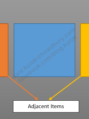
By default, the control shows the adjacent items in the screen but you can collapse the adjacent items by setting “None” as value towards the AsjacentItemsPreviewMode property as shown in the above code.
Here is how the adjacent items looks in the screen of Windows Phone:

Though the control slides automatically by left-to-right or right-to-left gestures, but you may want to include buttons for manually sliding the items in the control. If you want to slide the view using button present in the Application Bar, add the following code snippet in your XAML page:
In the code behind, you need to call proper APIs to move to previous or next item. Here is the process to implement this functionality in your application:
You can also integrate some other functionalities which are present in this control. You can specify whether to loop through all the items, whether to enable the pull to refresh functionality and show a overlay content on tap. You can also specify the orientation of the control to best suit your need.
I hope that, this small post was useful and you can now start building your Windows Phone application using this control very easily. Let me know, if you have any queries or issues using this control. Don’t forget to participate in the giveaway contest which is currently going on (check out the date and see if you are still eligible) and win this entire control library from me.
Subscribe to my RSS feed and email newsletter to get instant update on articles, tips, news in your inbox. I am also available in Twitter, Facebook and Google+. Connect with me for any technical discussion.


