How to Crop an object using Expression Blend?
Few days ago, I published a XAML Tips " How to Convert a Rectangle to a Path Control using Expression Blend? ". Today in this post...- Article authored by Kunal Chowdhury on .
Few days ago, I published a XAML Tips " How to Convert a Rectangle to a Path Control using Expression Blend? ". Today in this post...- Article authored by Kunal Chowdhury on .
Few days ago, I published a XAML Tips "How to Convert a Rectangle to a Path Control using Expression Blend?". Today in this post, we will discuss on another tips similar to that post. In this post, we will discuss on the steps to crop an element to give a desired output.
This post will help a beginner who just started designing XAML using Expression Blend. Hope, this small tip will help you to understand it in better way. Read to know more on this topic.
Let's begin with the demo. Here we will add two Ellipse (Circle) in the XAML page, one on top of the other but in a little different location. Then we will crop those controls to create a different shape. Follow the below steps to start with.
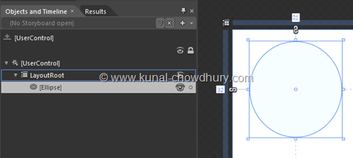
To do this, we will add a circle using the Ellipse control in the LayoutRoot of the XAML page as shown below:
Similarly, add another circle using the Ellipse control inside the same Panel. In our case, it is the LayoutRoot of the XAML page. This will add the second Ellipse on top of the other, but place the 2nd control to a different location as shown below:
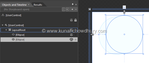
Here you will see that, there is a gap between the two controls. In the next steps, we will crop that portion from the one using the other.
It's time to crop them to create a different shape from those. We will subtract the 2nd circle from the first one. To do this, select both of them as shown here:
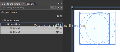
Once both the controls are selected, go to menu bar "Object" -> "Combine" -> "Subtract". This step will subtract the second control from the first one. You can try with the other four options mentioned there too.
For our demo app, here is the instruction set shown in the below snapshot:
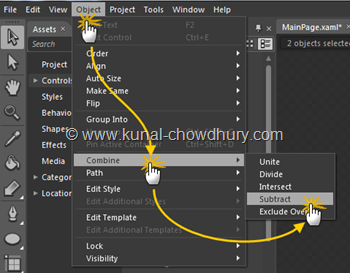
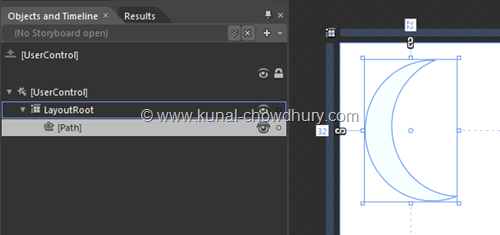
When you click on the "Subtract" menu item, you will notice in the Object and Timeline panel that the two Ellipses has been replaced by a Path control. The IDE changed them automatically to create the shape. In the design view, you will notice that the shape has been created as desired.
Find the screenshot here:
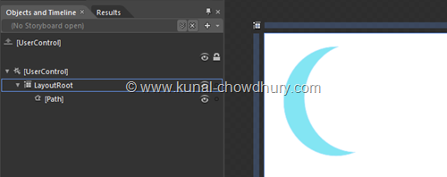
Now you can do whatever you want with the control; you can set background, border etc. You can modify all the properties that you can do for Path control. Let's change the Background color to see the control properly and here it is:
Hope this tips was helpful for you to understand the process to crop the controls easily using the Expression Blend. It is very difficult to create such complex controls from XAML but Expression Blend will help you to do those in just a few clicks.
So, enjoy designing your XAML page without a huge effort. Cheers.
CodeProjectThank you for visiting our website!
We value your engagement and would love to hear your thoughts. Don't forget to leave a comment below to share your feedback, opinions, or questions.
We believe in fostering an interactive and inclusive community, and your comments play a crucial role in creating that environment.